

Cloud is a SaaS company developing a tool to connect products with digital content through QR Codes, ID Tags and Cloud Services.
I was a Lead Product and Graphic Designer at Cloud.
PROJECT OVERVIEW: I worked directly with Cloud’s Founder and CEO, another Lead Designer, 2 front-end developers, and 3 back-end developers. We created a multifaceted working app and webpage. The entire project took us a little over a year. The first 3-6 months were primarily focused on creating a brand identity and style guide. That is what this case study focuses on.
Challenge:
How might we create a modern and friendly style guide and brand identity that stays within the All4labels guidelines?
KEY OBJECTIVE: We are beginning with nothing, and want to create the most powerful QR editing software on the market. The first task was to create a cohesive style guide that we could utilize throughout the design process to ensure continuity throughout the app.

Design Research
Cloud began with ideation, market research, and comparative analyses.
At the beginning of every design project, I like to immerse myself within the market I am trying to break into. For this project, we were creating something that had never been done before, so there were no competitors to compare ourselves to. However, the Founder still had brands that he wanted to emulate through his designs.
The Founder’s main design inspiration was Apple. He wanted to create a brand that had the same modern and minimalist feel. This dictated our minimal buttons and content fields, as well as our platform colors.
He also wanted the app to feel friendly and inviting. We ended up achieving this through our graphics and illustrations.
Now, to some of the basic decisions…
Creating Style Guide
Font
We chose Jost as our primary font.
Jost is a modern take on the classic font, Futura. Futura is a sans serif font inspired by Bauhaus, an influential design and art movement that embodied “simplicity, bold lines, and geometric shapes”. These qualities are exhibited through Futura’s letterforms. The letters "O" and "A" are nearly perfect circles and triangles. The letter’s strokes also have very little contrast. You can see the use of Futura font in brands such as Nike & Dolce Gabbana.
Jost embodies the geometric characteristics of Futura, with some changes that make it perfect for modern day. For example, Jost increases the contrast of thick and thin strokes, which make it more favorable for digital screens. It also has a total of 9 weights, making it a very customizable font, preferable by designers.

Brand Colors
I think color choice is extremely important, and I did not take choosing our company’s colors lightly. I dove into a deep hole of color analysis and research. When the Founder presented the colors I chose to our Investors, All4Labels - Global Packing Group, they said they wanted us to use their brand colors.
No matter, I continued my color analysis on All4Labels color palette (which is now Cloud’s).
Dark Blue is often connotated with authority and reliability. Navy blue specifically is considered to embody professionalism and sophistication. Finally, red expresses feelings of passion and power.
This is a simple color palette and reminds me a little bit of Google’s color palette. A simple color palette like either of these examples, is less intimidating and more trustworthy—appropriate for a company that prides itself on making things really easy to use.
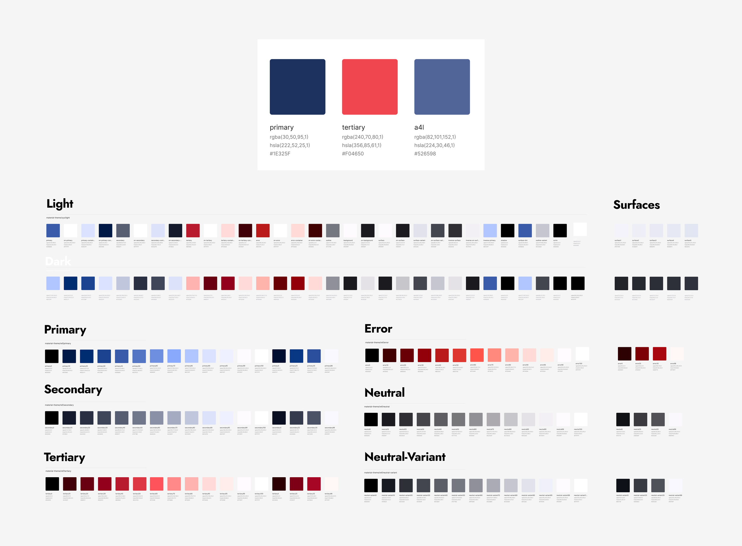
Color Component Library
The coolest feature of our Color Component Library, is that it is responsive to dark and light mode.
Apple and Google have set a standard that digital surfaces will change color depending on the time of day (or based on user preference). I knew I wanted to create a platform that would easily transition between both modes. To make it easier when designing down the line, I specified light mode colors and their dark mode opposite. Now, when we design surfaces, by simply changing the background color, all of the colors on the screen will adhere.

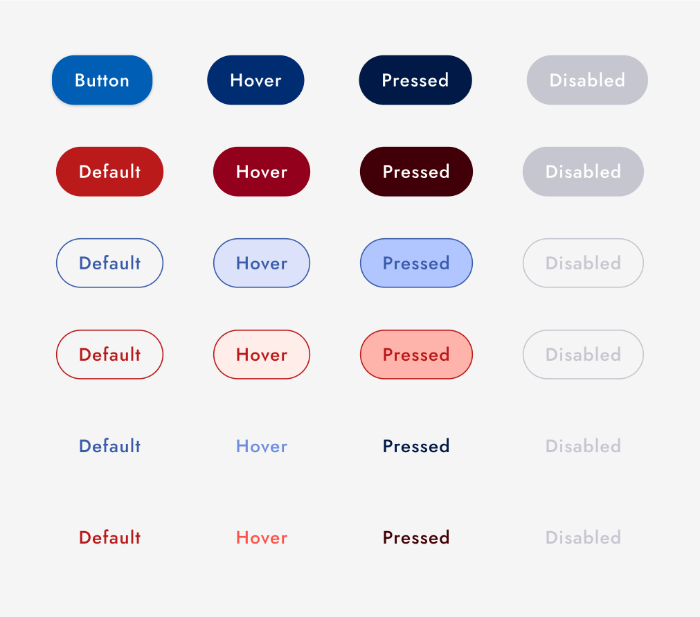
Buttons
I wanted to create a really simple rounded button that is reminiscent of Apple’s buttons.
In order to do this, I created a button that is just the primary brand color, no shadow and no outline. I found that adding a shadow or outline felt more outdated. In my comparative analyses, I found other modern brands using a similar button. If I would have had control over color, I would have made our primary color brighter (more neon), but we were boxed in on that front.
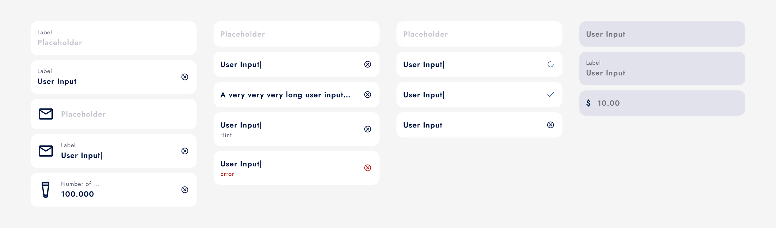
Form Fields
The idea behind this app is that users would be able to input mass amounts of data concerning their products, and the software would produce a unique and customizable QR Code or RFID Tag, which would encompass all that data.
When creating the form fields, it was important to keep our minimalist style, but include lots of information. Our final form field has a very thin outline to differentiate it from the screen background. Like our buttons, there is no shadow because it seemed to age the feature. Clean and clear was the motive here. When building the app, these form fields continue to be expanded upon as new ideas popped up. However having a basic component to work from made these changes seamless.
Now… after all of that…the real building can begin.
You can see evidence of the style guide throughout Cloud’s app.
By taking time in the beginning of this project to articulate a strong brand identity and style guide, we ensured our product was cohesive and stylized. I look forward to doing something similar in future projects.

Thanks for reading through this case study!