Guardian Bikes, backed by Shark Tank’s Mark Cuban, makes the “worlds safest children’s bike”.
Project Overview
CONTEXT: For this Project I worked as a Freelance Designer for Silent Howl Studios. Silent Howl Studios was approached by Guardian bikes to re-design their landing page. I worked with Silent Howl Studio’s Lead Designer.
PROBLEM: Guardian Bikes was running a successful Facebook Ad, however their conversion rates from their landing page were low. Users would click onto the landing page from Facebook, but that is where their journeys ended. It was our task to fix this.
KEY OBJECTIVES:
How Might We improve the overall user journey, from Facebook Ad to Landing Page?
How might We encourage users to continue their journey through Guardian’s site and learn more about the Product?
How Might We improve Guardian’s conversion rates?
ROLE 🎨 : Product Designer (team of 2)
TIMELINE ⏰ : 1 Week Design Sprint
TOOLS 🧰 : Figma, Photoshop, Google Suite
Research
Interviews:
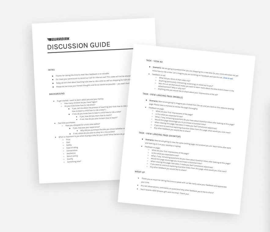
In order to understand the issues users are having with the landing page, we needed to talk to them directly. We conducted a total of 16 user interviews/usability tests in order to gather in-depth qualitative insights. We asked users about their experience teaching their child to ride a bike and of any previous bike buying experiences. We also asked them to look over the current landing page on both desktop and mobile.
Using our discussion guide, we obtained a plethora of data, compiled it into a spread sheet and began synthesizing. As a UX Designer is obligated to do, I color coded key takeaways from each interview on sticky notes. Once the information was laid out in this way, I began grouping similar sticky notes to identify patterns and determine the most popular/important insights.
What is working
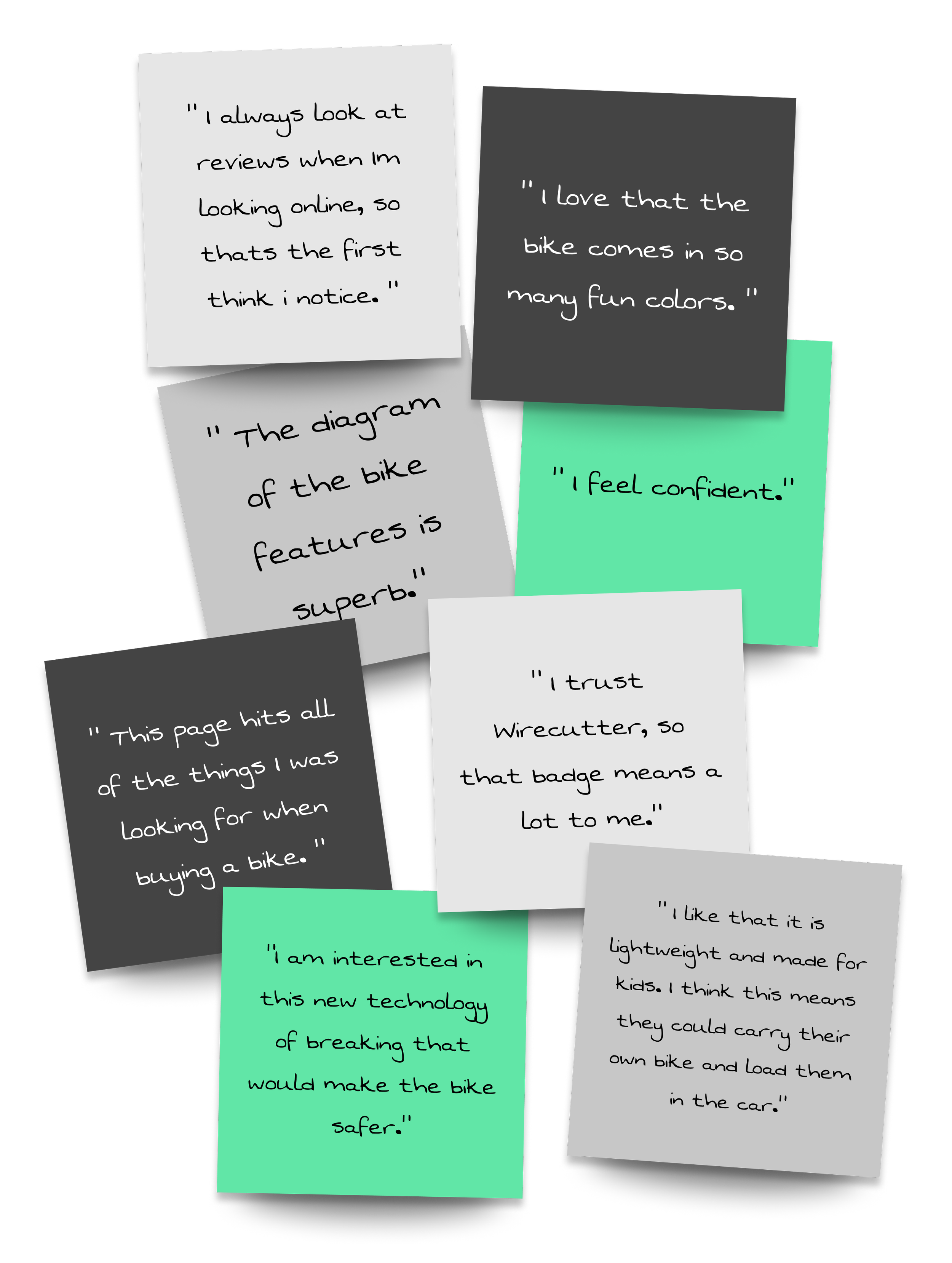
100% of users are interested in learning more about Guardian and/or purchasing a Guardian bike in the future.
Overall, users are a fan of Guardian. Parents love that the bike is lightweight, comes in fun colors, and has safety features that make it exceptional for kids.
95% of users say they like the diagram that lists all the features of a Guardian bike.
Parents want to know if spending $100-$300 on a bike that their kid will grow out of in a couple years is worth it. They really appreciated the features diagram, because it lays out what makes Guardian bikes special. Users did say that the diagram was much more clear on desktop than it was mobile.
98% of users believe Guardian is a trustworthy brand.
Users specifically liked the wire-cutter badge placed on the hero image at the top of the page, as well as the reviews at the bottom of the page. Some users did say they weren’t sure if they trusted all of the reviews and would want to verify them on a third party site like Amazon.
What isn’t working:
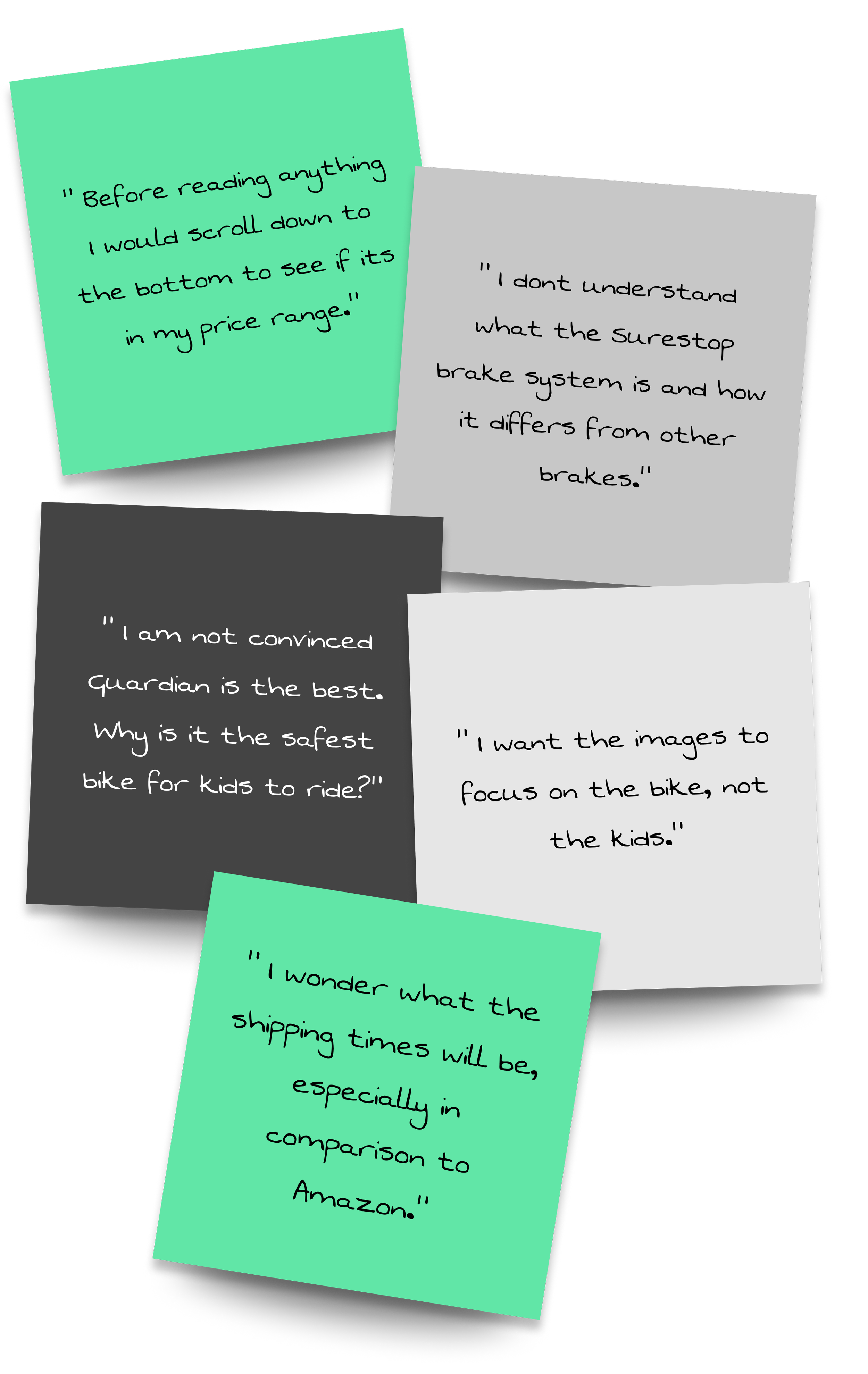
86% of users wished there was a stronger focus on the product.
Users wanted the price of the bikes and product images to be placed higher on the page so they dont have to go hunting for it.
30% of users were not convinced that Guardian is a superior bike to competitors in the same price bracket.
Guardian boasts about being the “world’s safest children’s bike”, but what does that really mean? Despite some effort to illustrate the aspects of Guardian bikes that make them so special, many users were still not convinced. It is clear we need to be even more specific.
92% of users had unanswered questions after reading through the entire landing page.
After scrolling through the whole page, users were still left wondering some things: Does the bike come assembled? Can I buy replacement parts? Can I buy accessories? How fast is shipping?
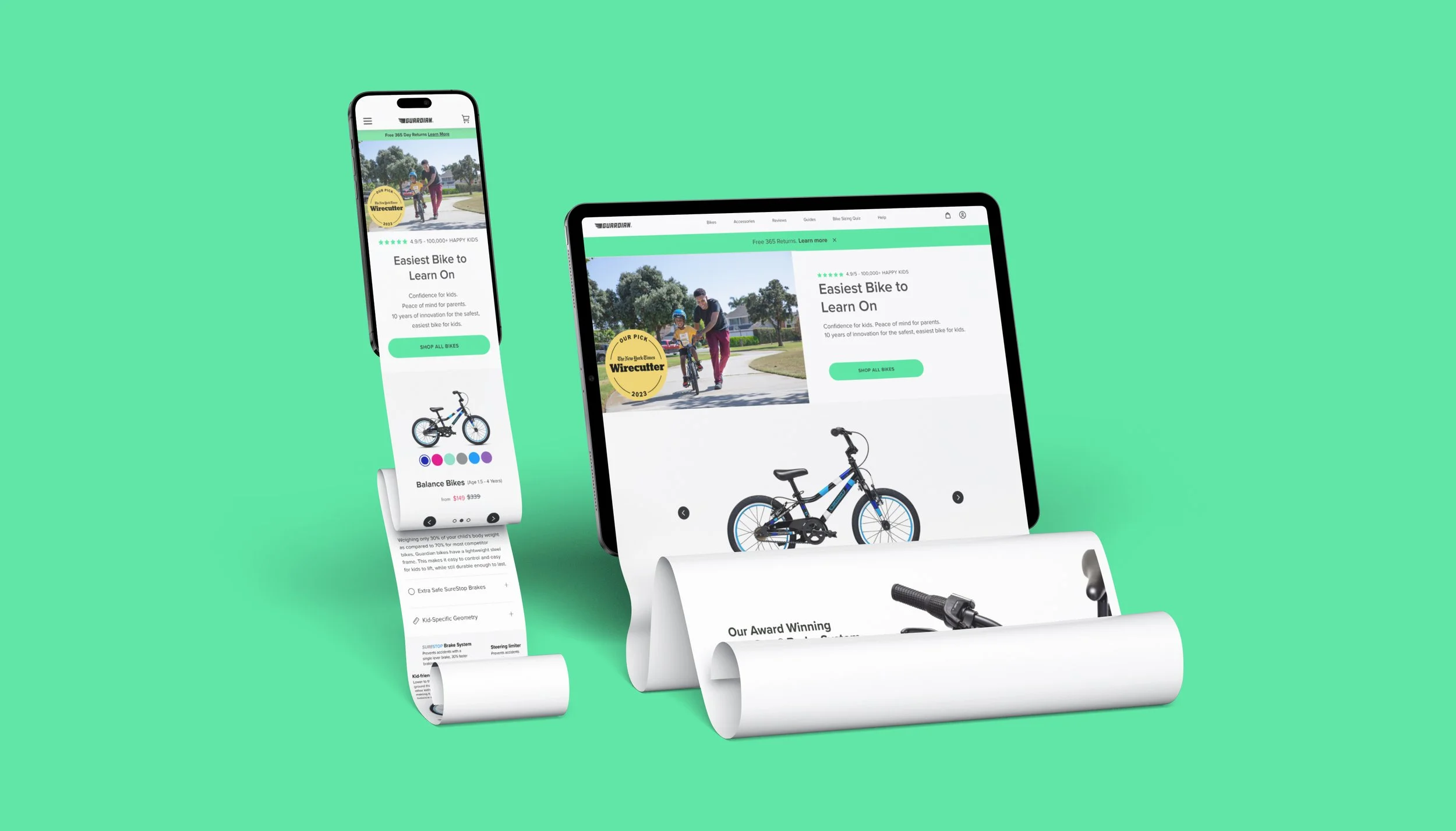
Now introducing the new landing page… and its improvements.
Highlight the product in the beginning
In direct response to the user feedback we received, I designed a section the goes right under the hero image that puts Guardian’s product and price on display. This should answer users initial queries if this bike is something they are interested in/can afford and prevent them from scrolling through all other information.

Prove “Why Guardian?”
Users felt they still didn’t understood what makes Guardian bikes so special. This was our second biggest concern to address.
First, we added a section outlining the three main reasons Guardian Bikes are the best bikes for kids.
Secondly, we included an option for users who were still curious about SureStop brakes, to watch a video and see the brakes in action. Guardian already had this video on their YouTube page, so including a link on their landing page was an obvious solution to user skepticism.
Improve What’s Working
95% of users liked the diagram that highlights a Guardian bikes’ features. However, the same users also reported that they could not read the diagram on the mobile version. In response, I created a mobile-friendly version of this diagram.
…and add a little more info
We addressed the 365 day warranty, shipping times, bike maintenance, and bike assembly in a small section beneath the diagram. These are important details but do not warrant as much attention as the other issues on the page.
Modernize & Legitimize Reviews
Some users were concerned that the reviews listed on the home page might be biased. I thought that we could try and legitimize the section by updating the current design. For example, the pictures they previously had featured were definitely staged photographs. In this updated design, I swapped them out of real pictures from user reviews. I also implemented Guardian’s current style guide in the new design, which was not previously applied.
…and promote accessories sales.
Around 50% of users wanted to know if Guardian sold accessories, like helmets and pads. They do, so we made sure to include a “quick add” feature of recommended accessories under the products listings.
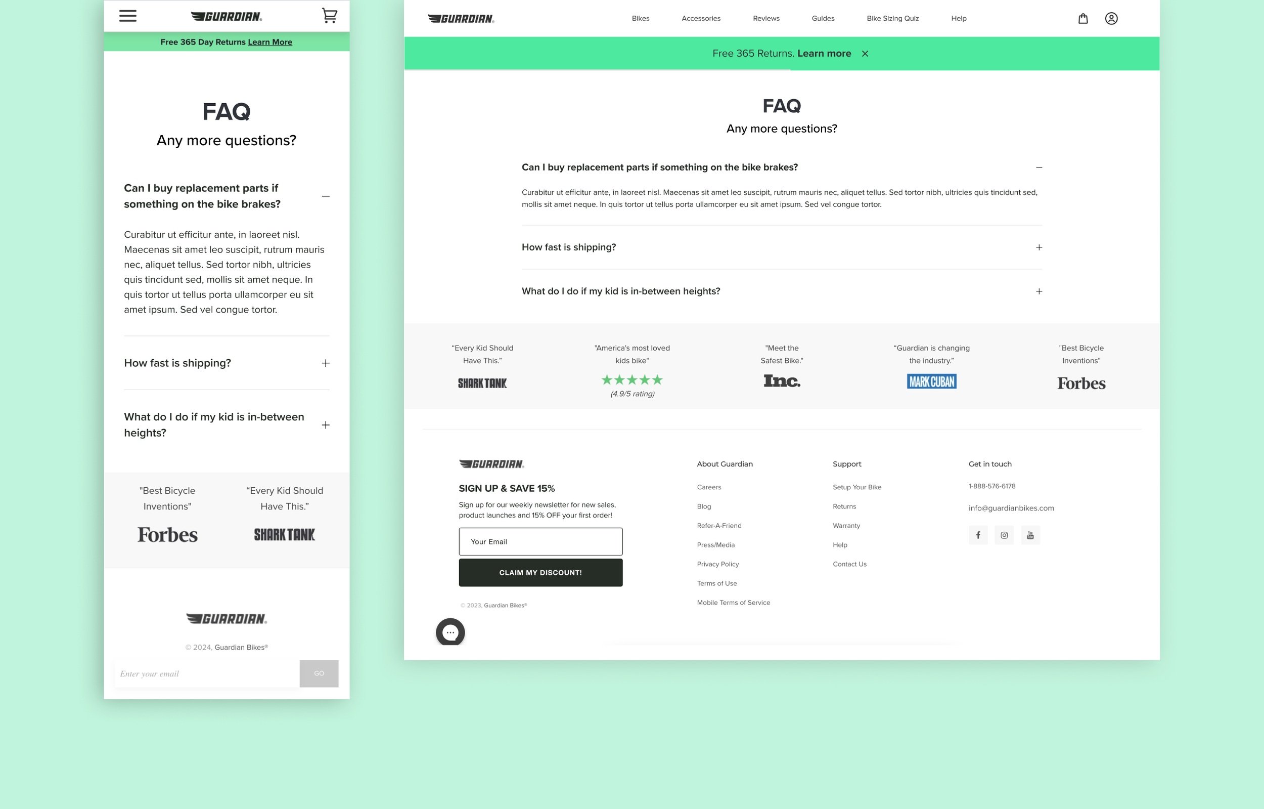
Answering Final Questions
Our last hope of answering any questions users may be left with was adding an FAQ section. We addressed three questions we discovered during our user interviews and usability testing, and Guardian can continue to add questions they think are important.