
MUSAY

Project Overview
A SIMPLE INTRODUCTION
MUSAY is a museum discovery app that helps people find museums, exhibits, and cultural events based on their location and interests. When I joined this project, the team was looking to expand its audience and make the app feel more engaging and useful. They knew there were usability challenges, and my job was to figure out where the friction was and how to design an experience that felt more personal and effortless for users.
My role was leading the UX design process — from research and defining the problems to designing solutions and working closely with developers to bring it all to life.
This project took place over two months, and I collaborated with a product manager, developers, and key stakeholders.

The Problem:
Users engagement and retention rate was low.
The biggest challenge MUSAY was facing is that their product was not engaging users enough for them to stick around. Users felt like the current product was irrelevant and overwhelming. For the business, this meant missed opportunities for user retention and growth.
Through early conversations with stakeholders, it became clear that making discovery feel personal and intuitive was going to be key. Users needed control over what they saw, and the app needed to feel curated — not cluttered.
Hueristic Evalutions
To understand what wasn’t working, I started by digging into the existing product from multiple angles - the first angle being my own Heuristic Evaluations. These were some things I noticed:
Visual inconsistencies and clutter
When I inspected the layouts, I noticed that most of the screens hadn’t been built using auto-layout structures. This led to misaligned elements, uneven spacing, and a general lack of structure. The result? Some screens felt cluttered, and the visual hierarchy was hard to follow — which made it difficult for users to know where to focus.
Low color contrast
On the home page, for example, some key text elements were set in a very light gray on a white background. This not only made them hard to read, but it didn’t meet basic Web Content Accessibility Guidelines (WCAG) for contrast. It was a small detail that had a big impact on usability, especially for users with visual impairments.
Confusing navigation patterns
Back and close buttons were used inconsistently throughout the app. At times, I found myself unsure whether clicking a button would take me back a step, close out of a modal, or move me forward in a process. That lack of consistency in navigation can quickly erode user confidence.
Accessibility gaps
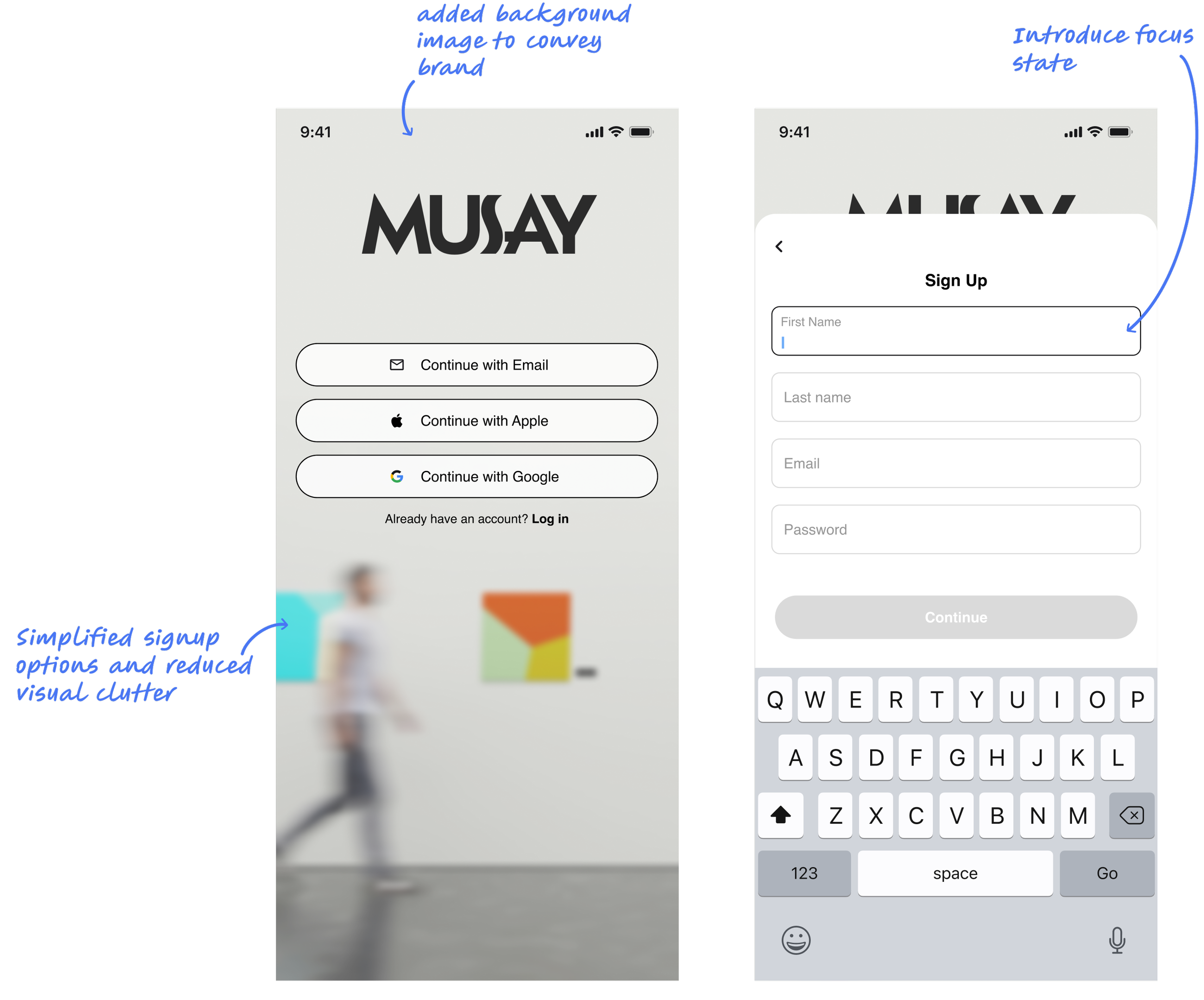
I also specifically audited for accessibility. There were no visible focus states for form fields, meaning users relying on keyboard navigation wouldn’t have any indication of where they were on the page. Additionally, if a user entered an invalid password or form error, there were no error messages — leaving them stuck without guidance.

Usability Testing
Once I had completed the heuristic evaluation, I wanted to validate those findings and see how real users interacted with the existing MUSAY app. So, I conducted usability testing with 12 participants, asking them to go through the onboarding process and then find event details using the app.
Right away, I noticed something interesting: some participants were totally comfortable telling me what they liked, but they seemed hesitant to point out anything they didn’t. Their feedback started to feel like they were telling me what they thought I wanted to hear, rather than what they were actually experiencing.
That reminded me of a technique I’d learned from a senior researcher on a past project — before starting each session, she’d tell participants that the design wasn’t hers, so they didn’t need to worry about hurting her feelings. That simple reassurance really opened people up.
I decided to take the same approach here. Before each session, I told participants that I was simply there to understand the strengths and weaknesses of the app and that honest feedback (good or bad) was incredibly helpful. Once I started doing this, I noticed a huge shift. Participants became much more open, specific, and candid with their thoughts — and I was able to gather helpful insights.…
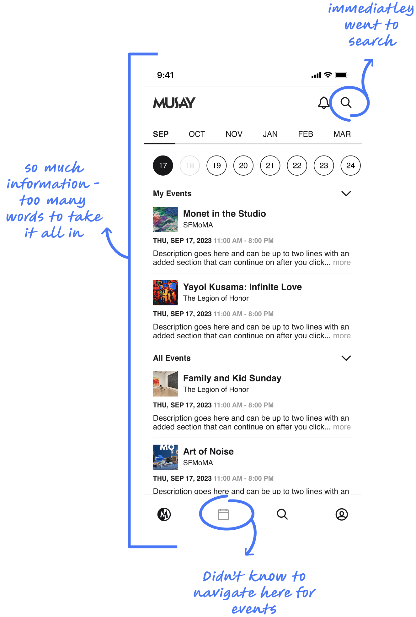
Users gravitated toward the top search bar rather than the bottom navigation to find events. I had flagged that the nav icon was unclear, but this showed me that users didn’t even think to use it.
Home page content didn’t resonate. Multiple participants mentioned that what they saw on the homepage felt irrelevant or uninteresting to them.
Navigation confusion was real. Users hesitated when moving between screens, unsure if they were “closing out” of something or moving forward in a process — something I had observed in my heuristic review.
When I explained the purpose of MUSAY, 75% of participants said they would be interested in using it — if it felt more tailored and intuitive.
One participant even said: "This seems like a much better alternative to doom scrolling on TikTok.”
Competitive Analysis
Before jumping into design solutions, I wanted to see how other platforms — across discovery, e-commerce, and social media — solved for content overload, personalization, and ease of navigation. Since MUSAY’s structure blended content discovery with a feed-like layout, I made a point to look at not only similar apps but also products outside the museum space that excel in content engagement.


I examined how Google structures search results, especially the way they use category tabs (like “All,” “Images,” “News”) and surface different result types in an organized, predictable layout. Their approach to showing top results first and offering filter refinement inspired the categorized search structure I designed for MUSAY.
ThredUp’s “My Sizes” feature became the inspiration for MUSAY’s “My Preferences” — allowing users to save filters that are applied by default for a more tailored experience.
Since MUSAY’s home feed felt similar to a social platform, I studied Instagram’s approach to content curation, subtle personalization signals, and dynamic recommendations. This inspired how I thought about making the MUSAY home screen feel fresh and continuously relevant.
I learned, organizing complex search results by category is critical. Google’s clear tabs and top-result prioritization reinforced the importance of helping users find what they need quickly. It is a very intuitive interface to navigate and the aesthetic is clean — everything MUSAY needs.
Persistent preferences build user trust and reduce friction. Platforms like ThredUp and Instagram make personalization feel effortless. These platforms have dedicated users because each interface is catered to them.
Problem Statement #1
Problem Statement #1
Problem Statement #2
HMW Questions
Next I turned those questions into HMW questions, which ultimately became the challenges that would guide my design process. Throughout the project, the team and I would refer back to these problem statements or HMW Questions to ensure we stayed on track.
How might we help users effortlessly discover content that feels relevant, personalized, and worth returning for?
How might we help users effortlessly discover content that feels relevant, personalized, and worth returning for?
Problem Statements
Between heuristic evaluations, usability testing, and competitive analysis — I started to see clear patterns. Users weren’t just struggling with confusing navigation or unorganized content; they were missing the feeling of discovery and personalization that makes an app feel like it’s built for them.
With that insight, I defined two problem statements:
Users don’t feel engaged with MUSAY’s content. Zahir, our persona, needs an easy way to discover museums and events tailored to his location and interests, so the app feels relevant, personal, and worth coming back to.
Users don’t know how to personalize their experience. Zahir needs a simple, intuitive way to set content preferences so he can avoid irrelevant results and feel in control of what he’s seeing.
Initial Wireframes
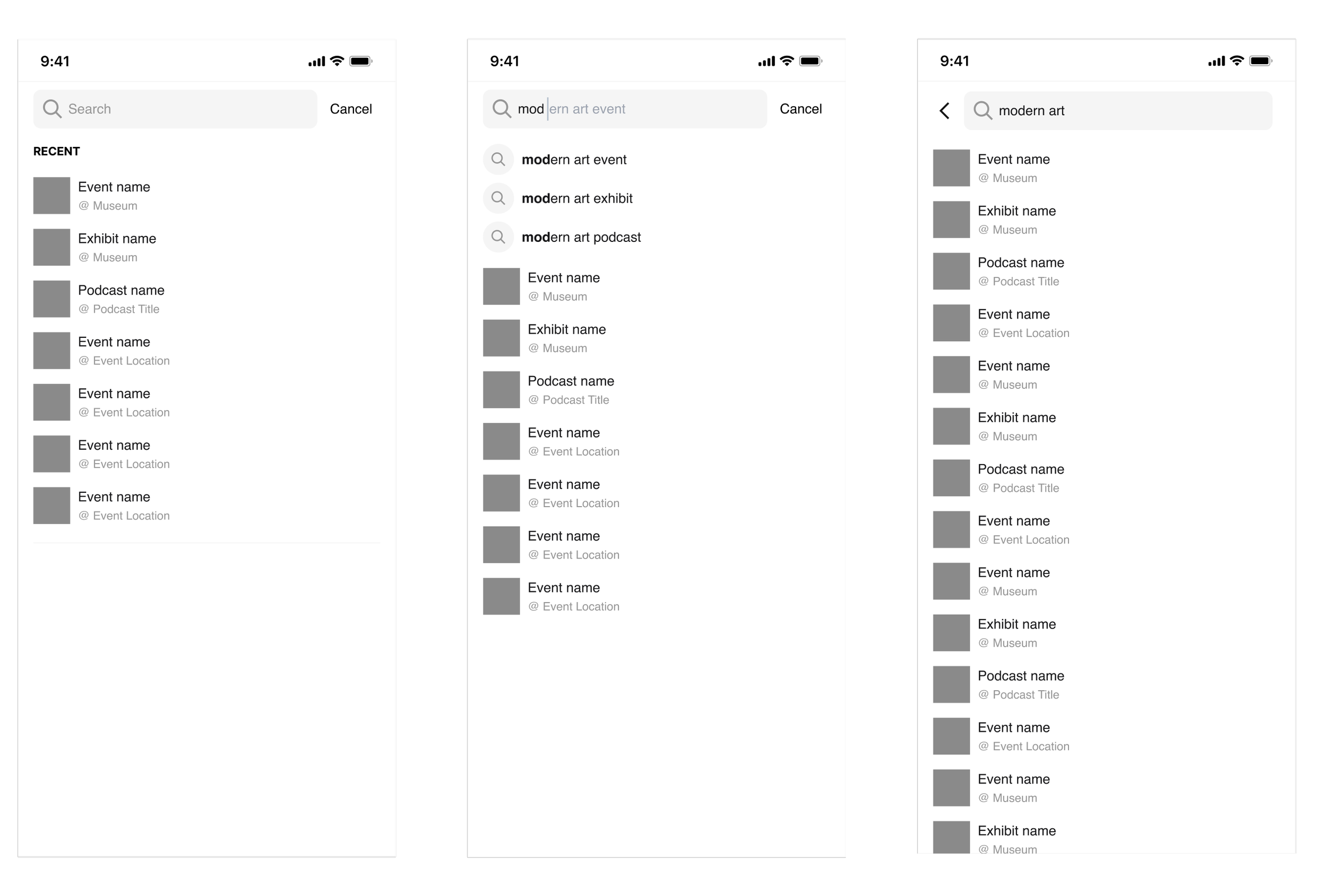
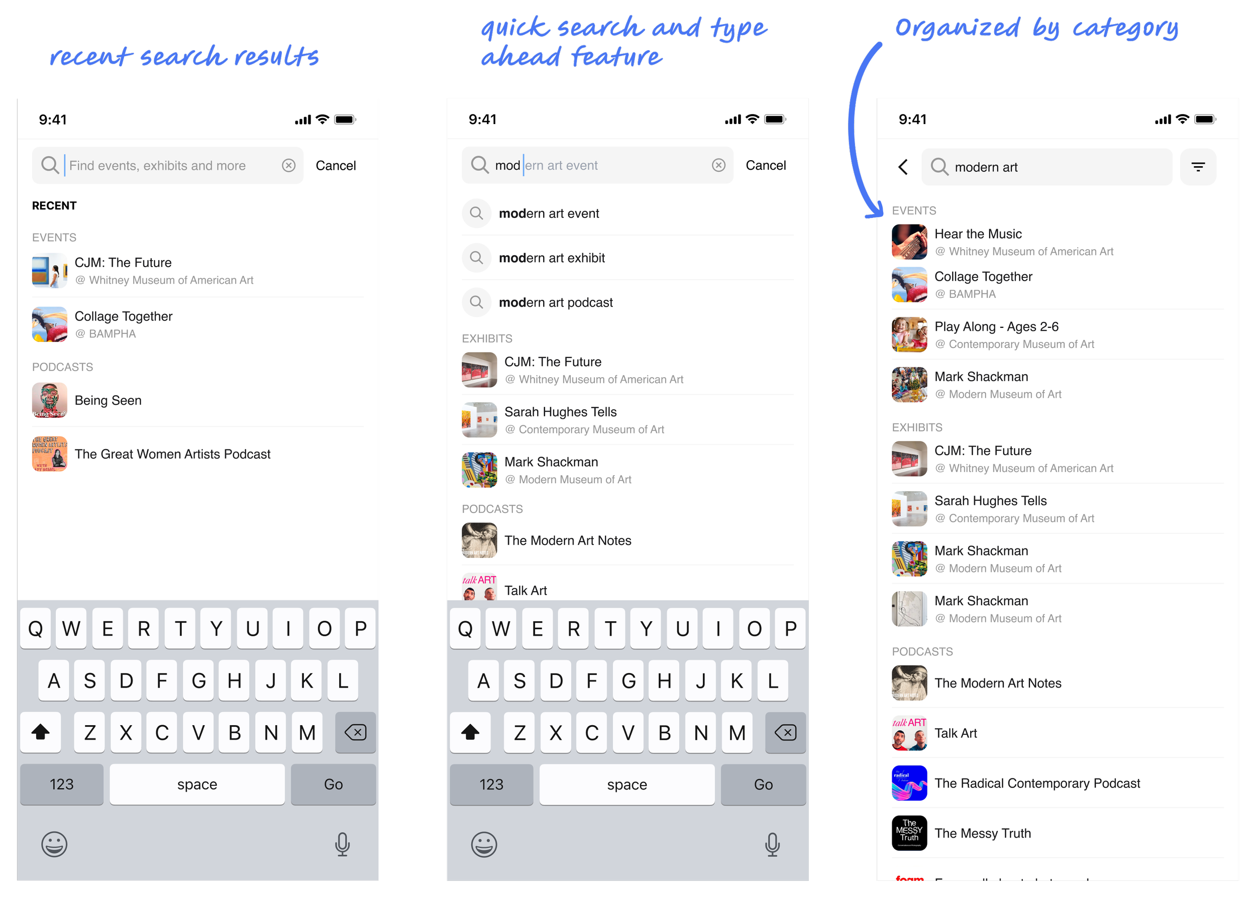
My early concept for search included: A default state showing recent searches, quick search suggestions appearing when users clicked into the search bar, and type-ahead suggestions forming as users typed.
After sharing these with stakeholders and the development team during one of our meetings, our conversation surfaced some really valuable points:
Consistency : MUSAY already used badges to categorize content (events, exhibits, podcasts, and museums) elsewhere in the app. The team agreed it made sense to bring that same system into search results to help users quickly scan and make sense of what they were seeing.
Visual hierarchy: My initial design was just a flat list of results. Through discussion, we agreed this would likely overwhelm users. Categorizing results and adding visual structure became a priority.
User control: We realized that even with categories, users would need to sort and filter results to make search more powerful. That became the next feature I started to design.
Performance considerations: The dev team flagged that showing dynamic type-ahead suggestions with category groupings could introduce loading delays, especially on slower networks. We discussed solutions like progressive loading indicators and fallback states to keep the experience feeling responsive.

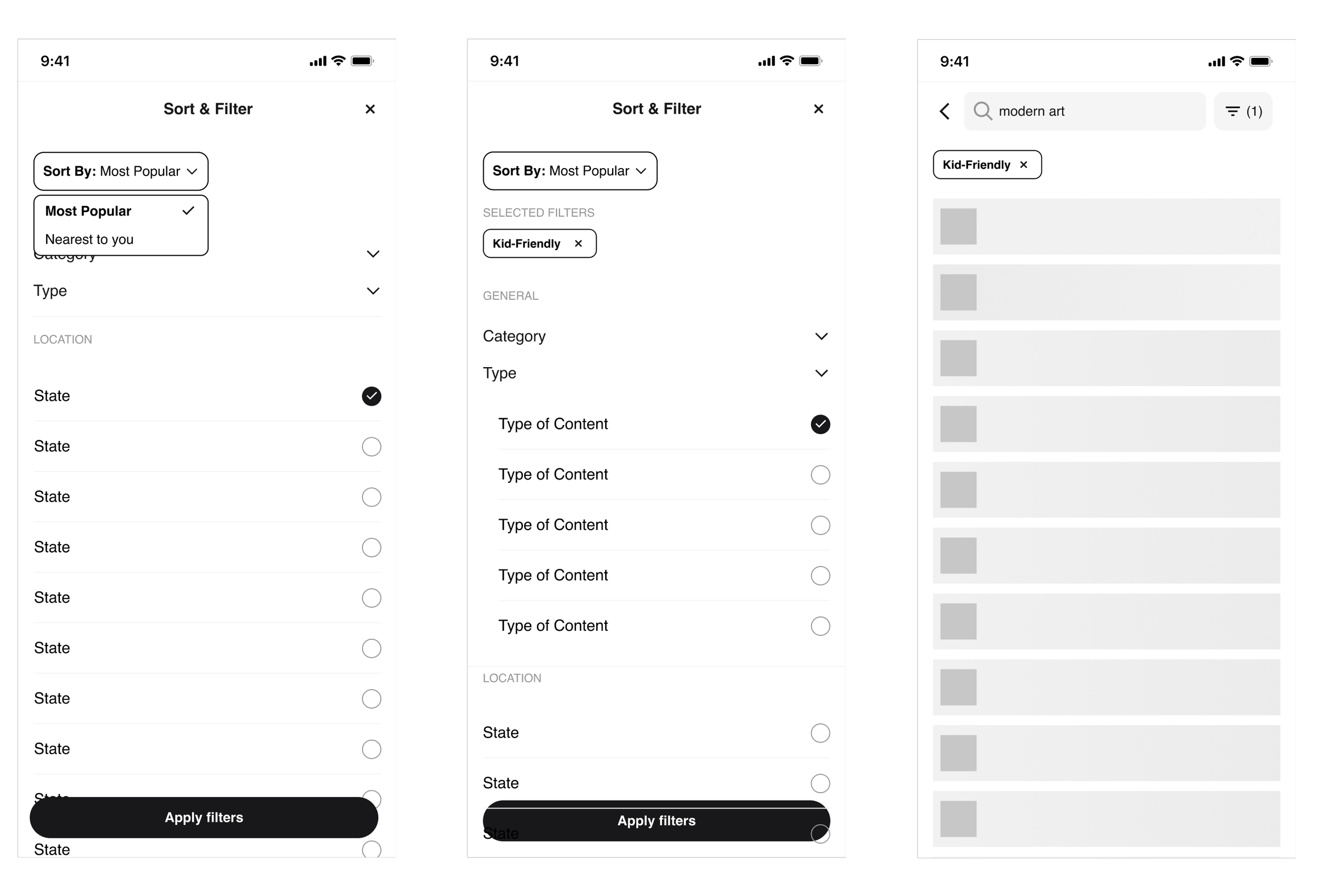
Next, I designed a filtering and sorting feature. I leaned on Baymard’s best design practices and competitive research to guide my process.
Initial features included:
Multi-select filtering, allowing users to combine categories (for example, searching both events and exhibits at once)
Active filters displayed as removable chips for quick adjustments
Sort options that made sense for MUSAY’s content: Closest, Newest, and Most Popular
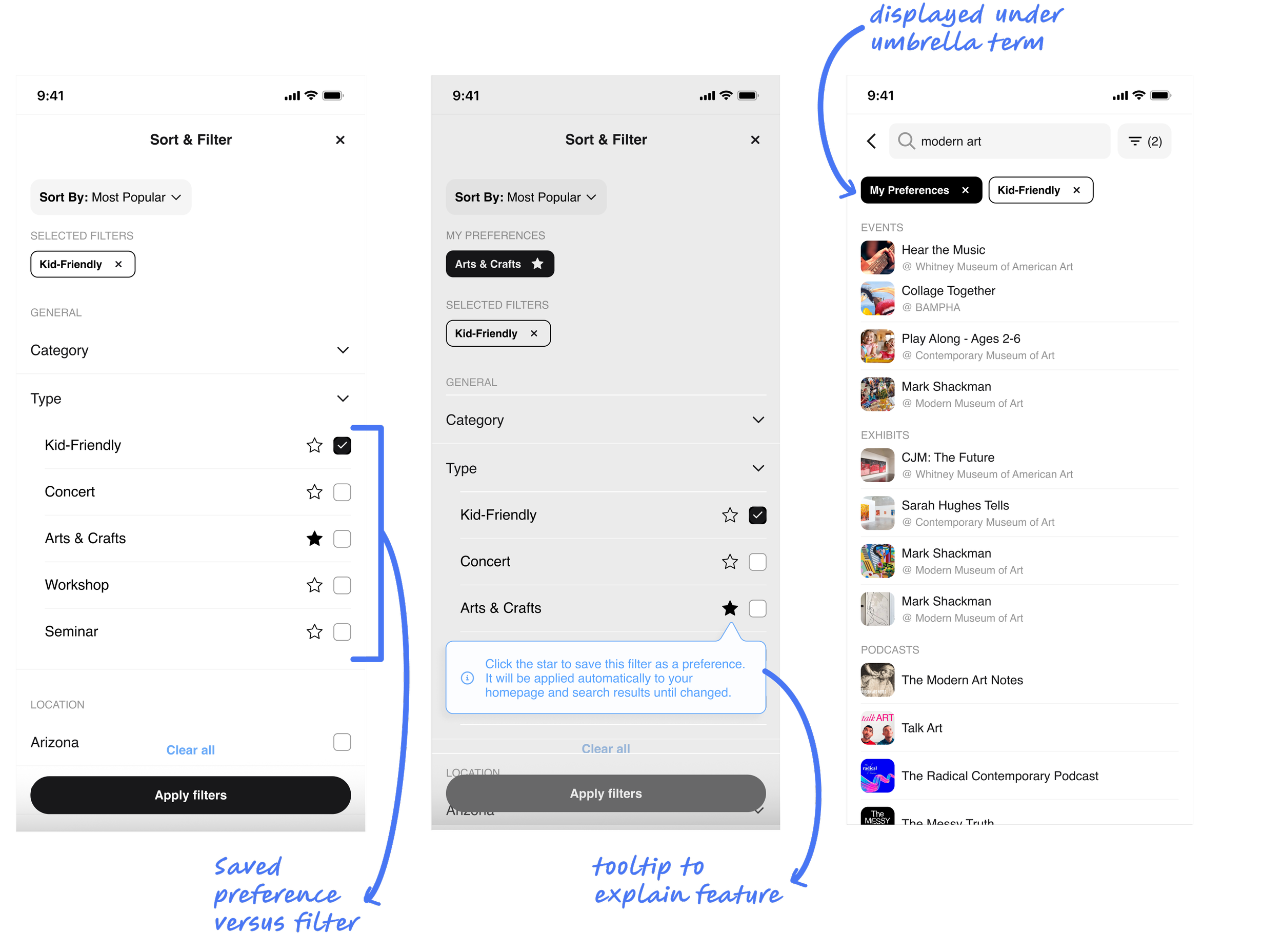
One of my favorite design moments came from adapting a concept I’d seen on ThredUp — their “My Sizes” feature. I brought this idea into MUSAY as “My Preferences.”
I designed this as part of the filtering experience: next to each filter checkbox, users could star certain filters to save them as persistent preferences. Those starred selections would automatically apply every time the user returned to search, appearing under a section labeled My Preferences in the active filters bar.
This gave users a sense of control and personalization without requiring them to adjust filters every session. It also supported long-term engagement — the app would start to feel like it “knew” the user.

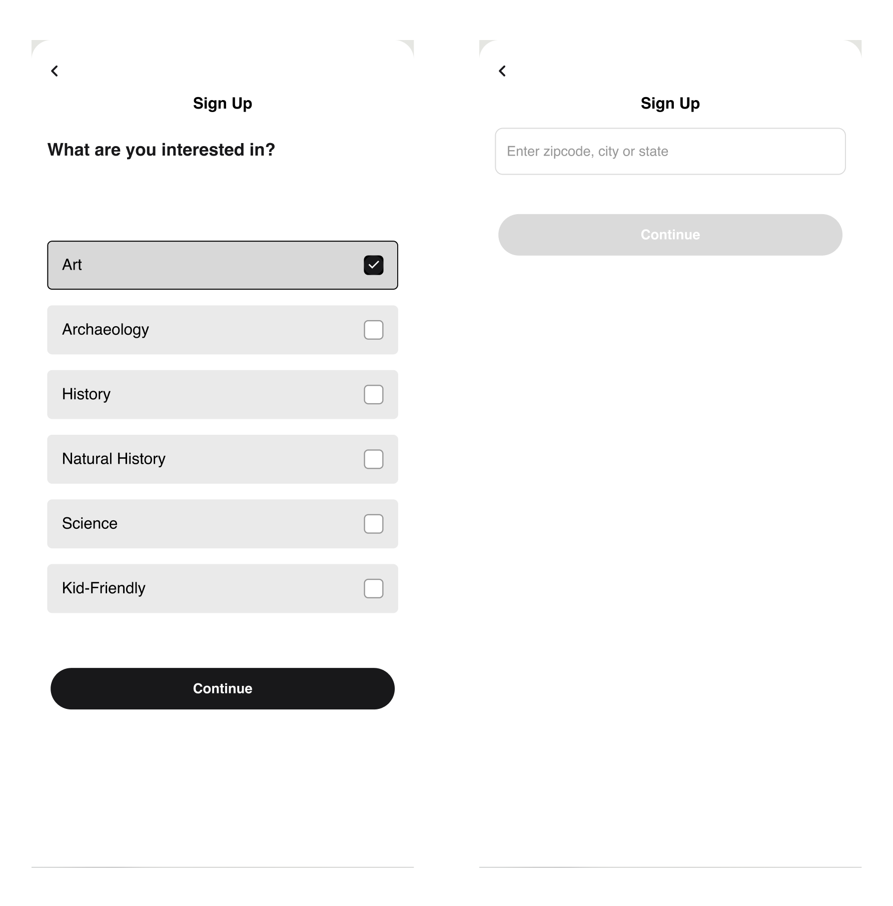
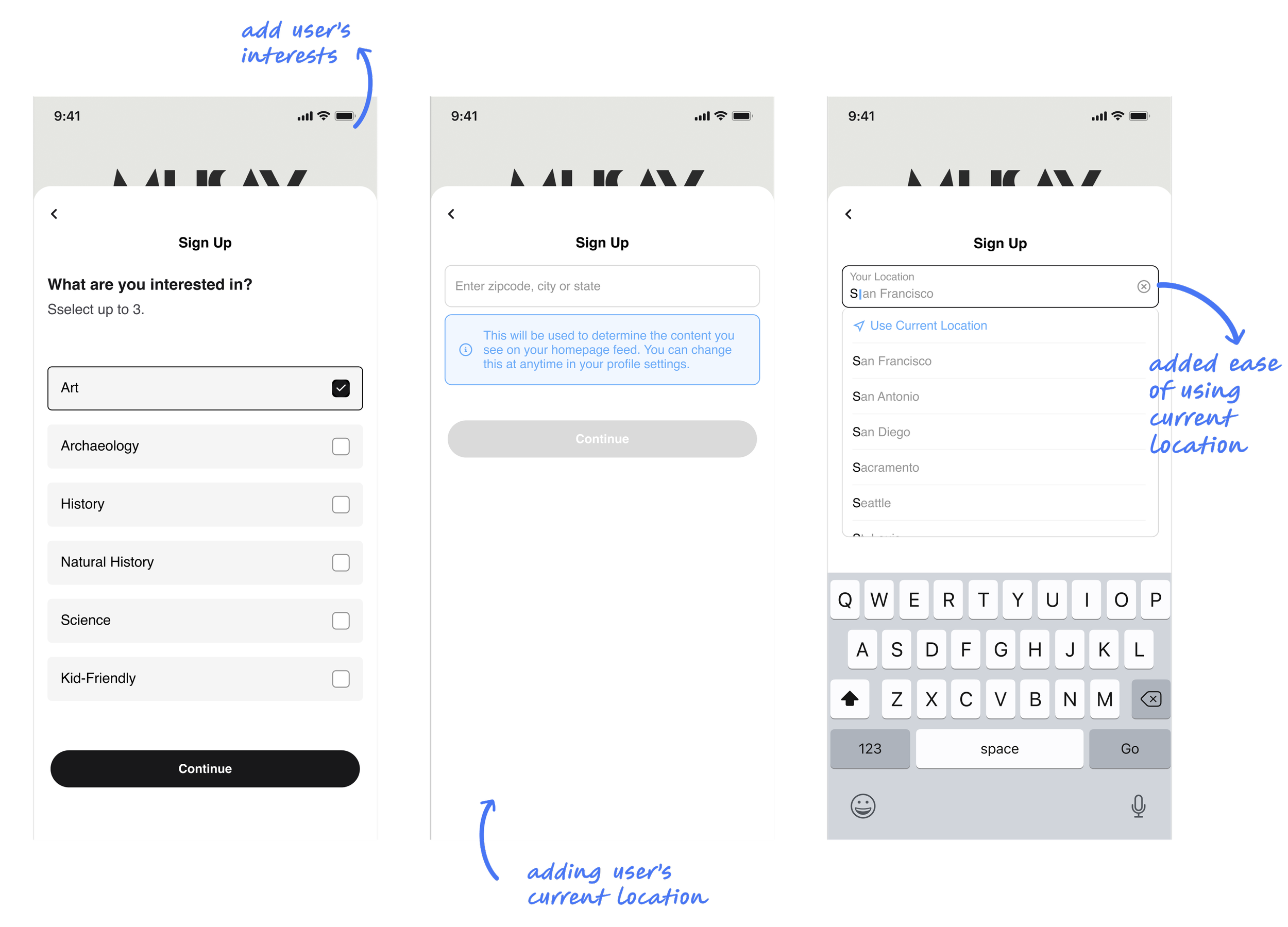
However the app would only know users once they started interacting with sort/filter/search… So when a new user creates an account, their first impression of the app hasn’t changed.
I solved this by introducing two new screens to the onboarding flow. The first screen lets users select the type of content they care about most — Art, Archeaology, History, Science, etc. — using a simple, friendly interface. The second screen allows them to set their location, so all content is geographically relevant from the start.
After several rounds of iteration, collaboration, and refinement, the final designs introduced a product that was more personal, intuitive, and scalable than before. Every part of the solution was directly informed by user research, competitive insights, and technical collaboration.
During this project I learned how important iteration is in finding the balance between user needs, business goals, and technical feasibility. By myself I could not have brought the relevant insight that was necessary to turn out this product.
So lets take a look at it…

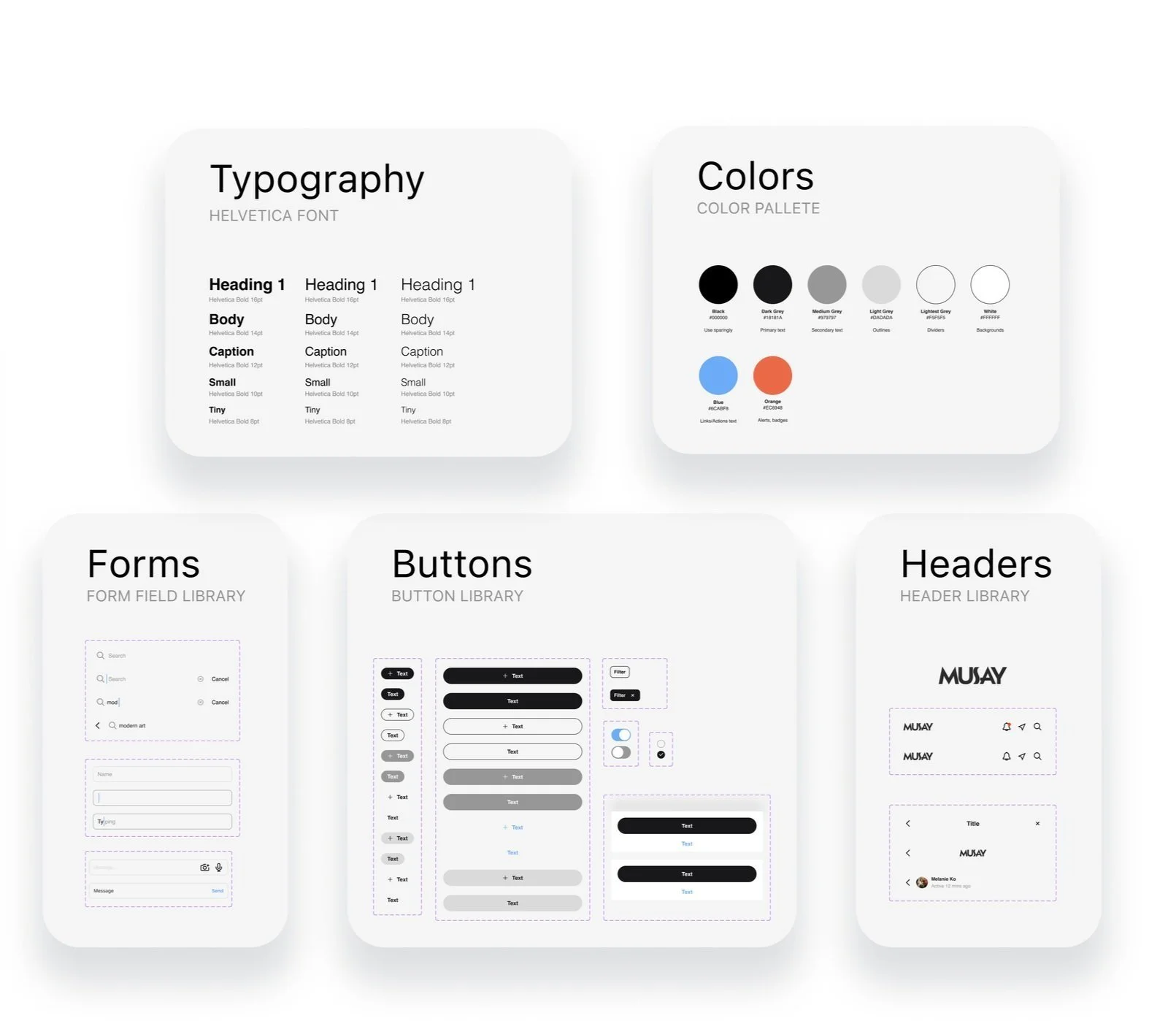
Design System
To support long-term scalability, I built a reusable design system and component library in Figma. This included buttons, input fields, filter chips, badges, cards, and a standardized color palette and typography system. I learned from this project that a well built design system is a crucial tool for developers. So not only does this library ensure visual consistency throughout the platform, but it made developer handoff smoother. And the cherry on top is it will make future iterations quick and seamless.
Personalized Onboarding
To address the early disconnect users felt with irrelevant content, I designed a simple two-step onboarding flow. Users could select the categories they were most interested in (events, exhibits, podcasts, museums) and set their location. This ensured that from their very first visit, the app would surface content that felt tailored and relevant.
Accesibility
I made targeted accessibility enhancements, including larger tap targets, improved color contrast for readability, focus states for keyboard navigation, and clear error messaging on forms.
Search
Search results were restructured with clear category groupings, using consistent badges to help users quickly scan and understand what they were looking at — whether it was an event, exhibit, museum, or podcast.
Filter, Sort, & Preferences
I designed a persistent filter bar that made filters easy to access and adjust at any time. Users could combine filters (multi-select) and refine results further with sorting options like Closest, Newest, and Most Popular. One of the standout features was the introduction of “My Preferences,” inspired by ThredUp’s "My Sizes" model. Users could star filters they wanted to apply by default in future searches. These starred preferences appeared under a dedicated My Preferences section in the active filter bar — giving users control and personalization that evolved with them.
The end
This project taught me the importance of balancing user needs, business goals, and technical realities. Specifically:
The power of reframing feedback: Early usability testing reminded me that sometimes participants need permission to be honest. By positioning myself as an impartial observer and encouraging open feedback, I was able to collect much richer insights.
Adapting patterns across industries works: I loved taking inspiration from retail (like ThredUp’s “My Sizes”) and applying it in a totally different context — it showed me how good UX thinking can be flexible and cross-disciplinary.
Dev collaboration makes or breaks great UX: Some of the best improvements came from discussions with developers, who helped shape solutions around real performance constraints and edge cases.
Personalization is more than a nice-to-have: When users feel like an app “remembers” them and understands their needs, it builds trust and loyalty. Even small touches — like saving preferences — can make a big impact.
Scalability matters: Building a design system didn’t just help this project — it set up the product team for faster iteration and better consistency in the future.

