

The Problem:
Silent Howl Studios hadn’t updated their website since 2009. Despite working with high-profile clients like Sephora and Uber, their outdated digital presence didn’t reflect the level of quality they brought to the table. I was brought in for a fast, focused refresh to modernize the brand and launch a new site that spoke to both scrappy startups and Fortune 500s alike.
Client: Silent Howl Studios – a boutique digital design agency
Timeline: 2-week design sprint
My Role: Sole designer — responsible for brand refresh, web design, and implementation
Tools: Figma, Squarespace
The Challenge:
The old site lacked clarity, structure, and polish. It didn’t reflect the caliber of clients Silent Howl had worked with, and the founder felt it was holding them back from landing new work — especially with startups who care deeply about visual credibility. We needed a modern, professional site that:
Showcased well-known clients while still feeling friendly and approachable
Clearly communicated what Silent Howl offers
Could be built quickly and maintained easily by the team
Research & Insights
Working internally at Silent Howl Studios at the time provided me with direct access to the founder - I was able to facilitate many collaborative workshops to lock down our brand's vision and objectives. I learned through these sessions and my everyday involvement with our clients, I realized Silent Howl’s primary clientele is early-stage startup founders.
To align our digital presence with the expectations of this audience, I conducted a competitive analysis of leading boutique creative agencies. This examination revealed several effective strategies:

Minimalist Design with Bold Typography:
Agencies like Clay employ clean layouts paired with striking fonts to convey professionalism and modernity.
Editorial-style storytelling:
Agencies such as Heco structure their case studies like curated stories, which makes even complex projects feel accessible.
Strategic Client Showcasing:
Agencies including Belle Epoque prominently feature high-profile clients, establishing credibility while maintaining an approachable tone.
With a clearer understanding of our audience and the competitive landscape, I moved into design. The goal was to translate those insights into a visual and structural system that felt contemporary, credible and uniquely Silent Howl.
Design Approach

I needed to appeal to two very different types of clients — early-stage startup founders and established brands — without alienating either. That meant designing for flexibility: the site needed to feel elevated, but not intimidating. Every design decision, from color palette to copywriting, needed to balance professionalism with warmth.
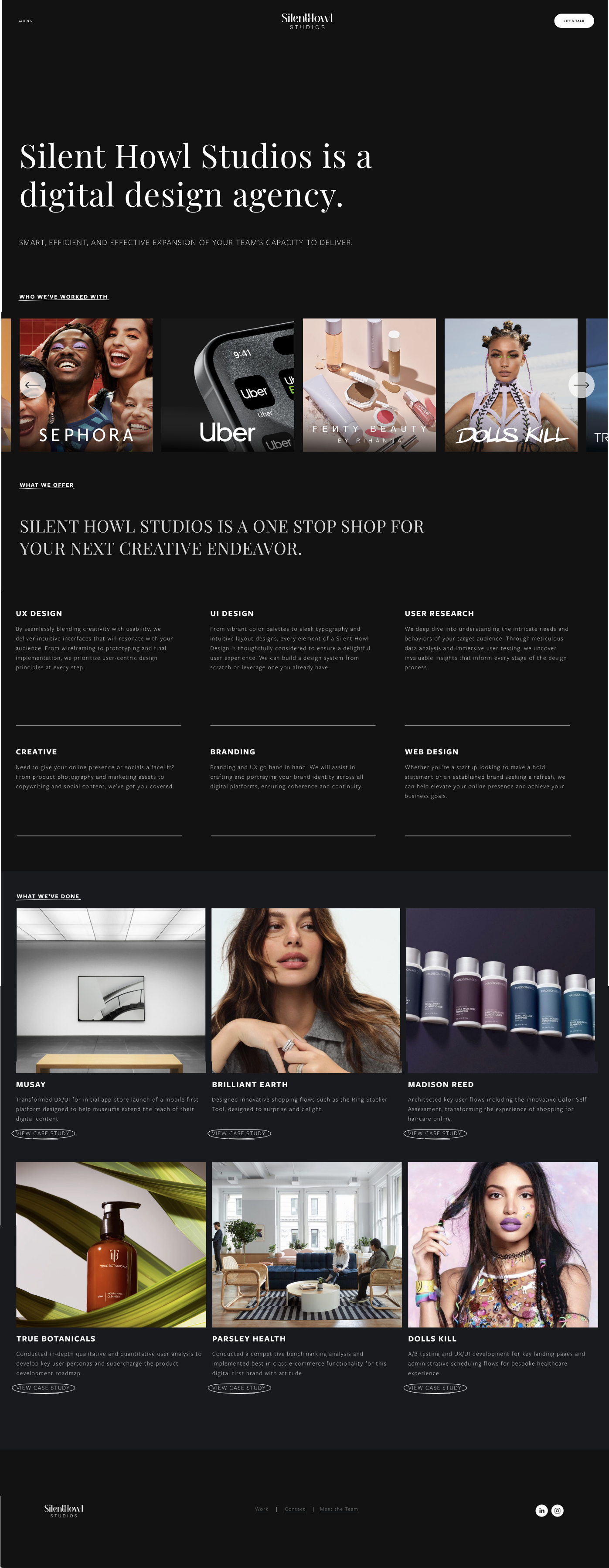
The first major decision, which Silent Howl’s founder had already made, was to establish a dark theme. This instantly set the tone for the site: modern, confident, and creatively led. Dark interfaces can often feel heavy or overly formal, so I made intentional choices around typography, contrast, and spacing to keep things feeling light and editorial. Paired with crisp white text and plenty of negative space, the dark theme helped the visuals feel refined without veering into “corporate” — exactly the balance we were going for.
Visual Identity
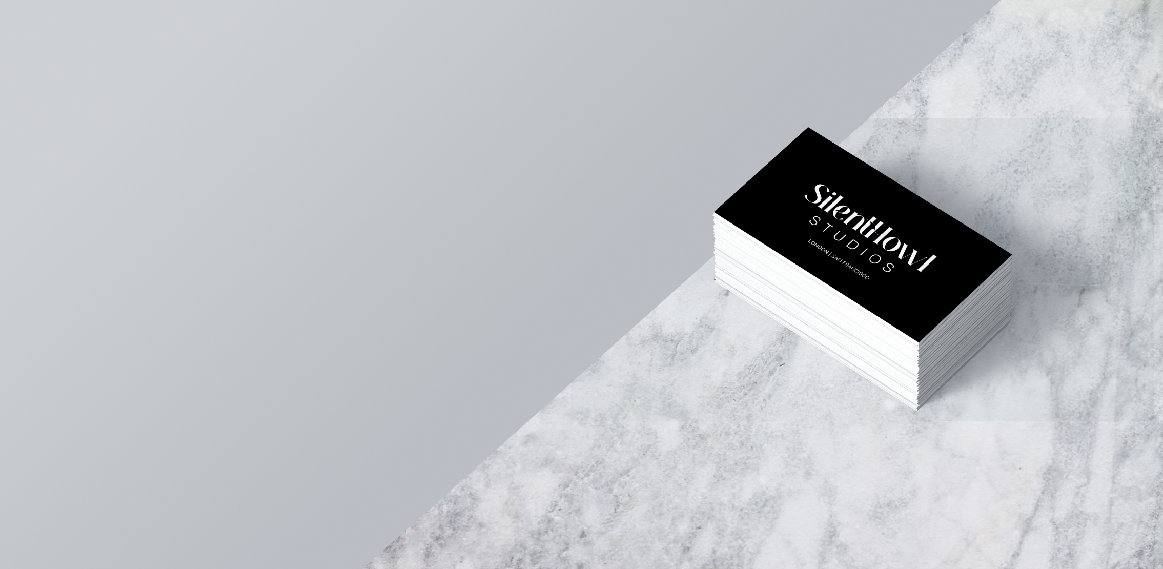
I started by refreshing the brand identity with a minimalist, font-based logo. The original branding felt outdated and overly decorative, so I stripped it back to a simple, confident wordmark. This gave Silent Howl a modern edge while still letting client work take center stage.
I also introduced a dark UI theme — a choice influenced by the founder’s creative preferences and broader visual trends in the design world. The black background and clean white type gave the site a more editorial, boutique-agency feel. It helped position Silent Howl as serious about craft, without feeling too buttoned-up.
Layout and Structure
We were working on a fast timeline, so I built the site in Squarespace for speed and ease of handoff. I customized the layout to balance storytelling with scannability — knowing that our users might not read every word, but still needed to understand our value at a glance.
Some key layout choices included:
A bold, scroll-stopping hero section featuring high-profile client logos (like Uber and Sephora) to establish instant credibility
A services section that clearly outlines what we offer, using plain language and visual cues to guide attention
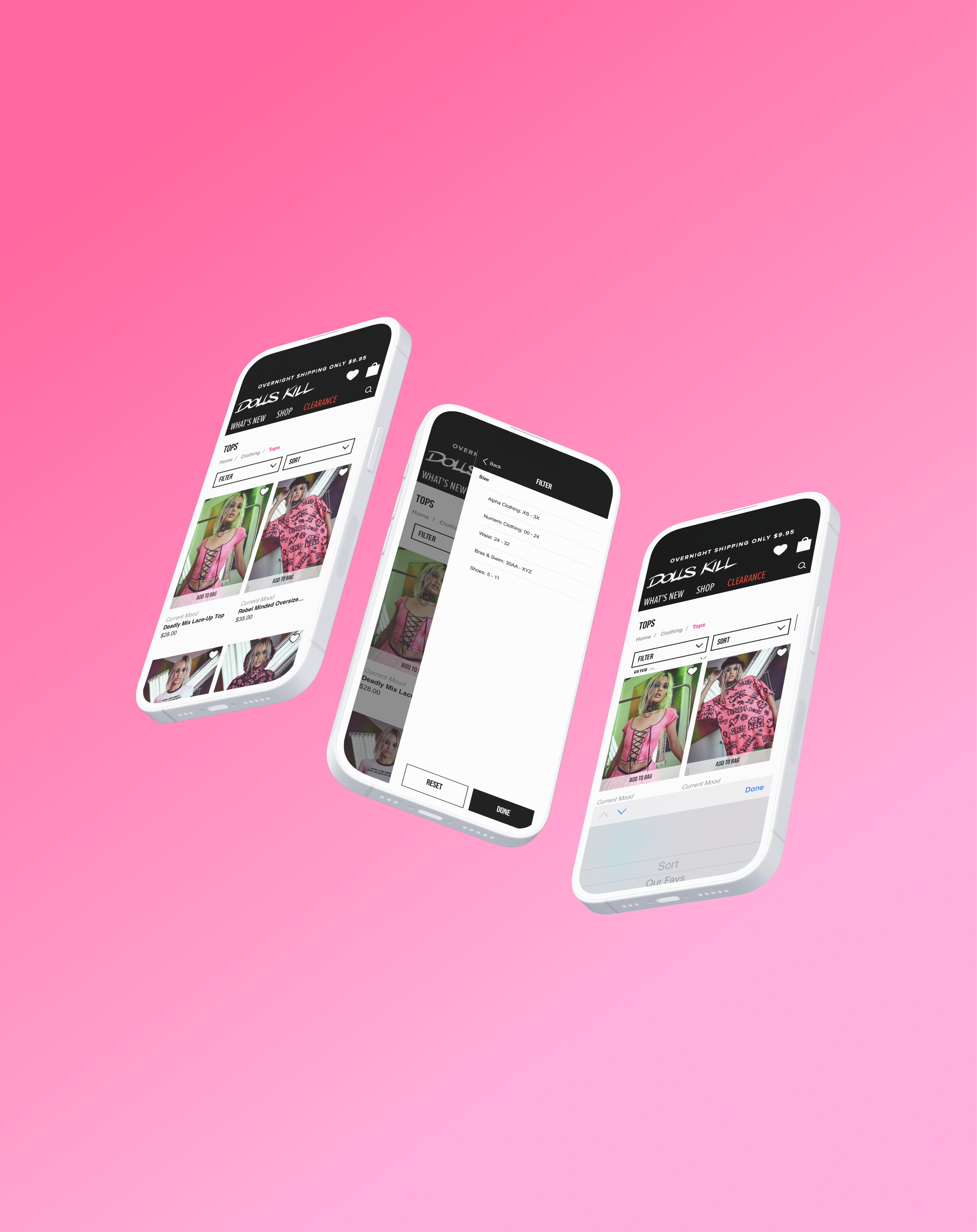
Highlight relevant case studies to establish credibility and showcase range.
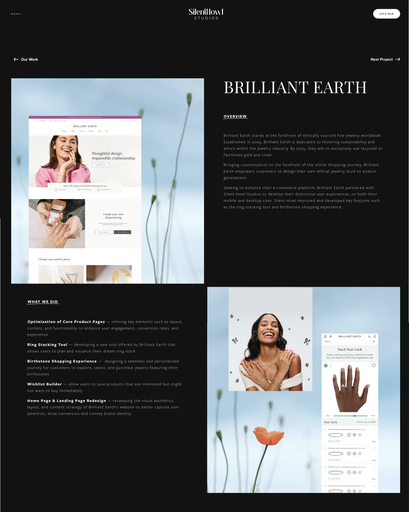
Custom image headers for each project, designed to give every case study a unique identity — especially helpful for users who skim or land mid-site.
Casestudies & Tone
From the start, I knew the tone of the site needed to feel human. We weren’t just another polished agency — we were a small, thoughtful team that partners closely with clients. I wrote copy that mirrored how we actually speak to people: conversational, direct, and a little bit playful when it made sense. The goal was to make every visitor — whether they were a one-person startup or a Fortune 500 brand — feel like they belonged.
I also created a modular case study template to ensure consistency across current and future projects.


Reflections
This project was a reminder that good design isn’t just about how things look — it’s about telling a story.
By focusing on structure, tone, and visual hierarchy, I was able to tell the story of Silent Howl - who they are and what they do. I successfully created a website and identity that felt aligned with their work: confident, creative, and collaborative.
Working solo on a tight timeline pushed me to prioritize ruthlessly, communicate clearly with the Founder, and make decisions quickly. It also reminded me how much I love shaping digital experiences that feel intentional from the first click to the final scroll.
Within the first few weeks of launch, the studio saw an increase in inquiries from both startups and larger clients. The founder shared that the new site gave them a renewed sense of confidence in client meetings — it finally reflected the caliber of work they were already delivering.
